
Advanced Skills - Statistics
Other than formal statistical tests, which we will cover shortly, statistics programs are good at producing summary statistics and drawing graphs to help you understand your data. While it is possible to produce really good quality graphs from these programs, it can be time consuming to do. As you have seen previously, many professional scientists still produce their final publication graphs in Excel, or other scientific graphing packages. However, the plots which come from statistics programs are useful to you to understand your data.
This may mean you never need to show anyone else some of these graphs, and you should never copy and paste lots of output from a statistics program into a report or piece of work you are submitting (although some people may want to see some of this analysis in an appendix).
Useful things you may plot or calculate:
Means and/or Medians of data with a categorical independent variable
Standard deviations, ranges and inter-quartile ranges of these data
Histograms - looking for 'normal distributions', or deviations from normal distributions
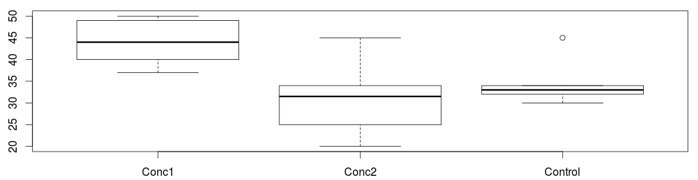
Simple scatterplots, bar charts or boxplots - depending on the independent variable
A video of how to 'examine data in SPSS'.
A video of how to 'examine data in R'. You can download the R script file here.
Back Next
Examining your data gives you a good feel for it. If you have properly examined your data, you will probably know what to expect from a statistics test. So, if run a statistics test wrongly, you'll probably know.
Other tests