
Advanced Skills - Statistics
Regression is probably the most commonly used method to test for relationships between data types. Running some exploratory plots after regression analysis is also the best way to test the assumptions of parametric regression.
However, while Pearson correlation and regression give the same results, a correlation is a better term to use to describe variables which are related, but don't appear to demonstrate cause and effect.
Videos demonstrating how to perform regressions are available on the previous page. The following however, gives a quick overview.
In SPSS:
->Analyse -> Regression -> Linear
For once, SPSS has used the terms 'dependent' and 'independent' so select relevant data.
Click on ‘Plots’
Select the plot as follows:
Y Axis - *ZRESID - X Axis – ZPRED
In R:
Set working directory to where the data file is stored
Load in data using: data1 <- read.csv('filename.csv')
Attach the data: attach(data1)
run the test: analysis1 <-lm(dependent ~ independent)
Changing the names of the variables to what they are called in your data.
type the command: summary(analysis1)
to get the output of the regression
run the command plot(analysis1) to check assumptions, especially from the first graph
The following video explains how to check assumptions of the regression from the plots produced, either in SPSS or R.
Typical output from a regression looks like this:
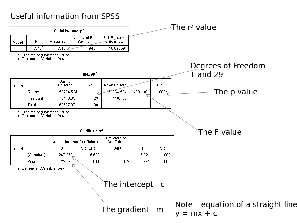
Download larger image here.
To interpret the regression, firstly look at the p value. If this is less than 0.05, then there is a significant relationship between the variables.
Next look at the r2 value. The higher this is, the stronger the relationship. An r2 of more than 0.4 is a fairly strong relationship for field studies. More than 0.7 would be considered fairly strong for most biological lab work. More than 0.9 would be required for subjects such as physics and chemistry.
If you have done A-level maths, you've probably come across equations of straight lines. If not, just ignore the final table.
Interpreting the R output:
Typical output from R looks like this:
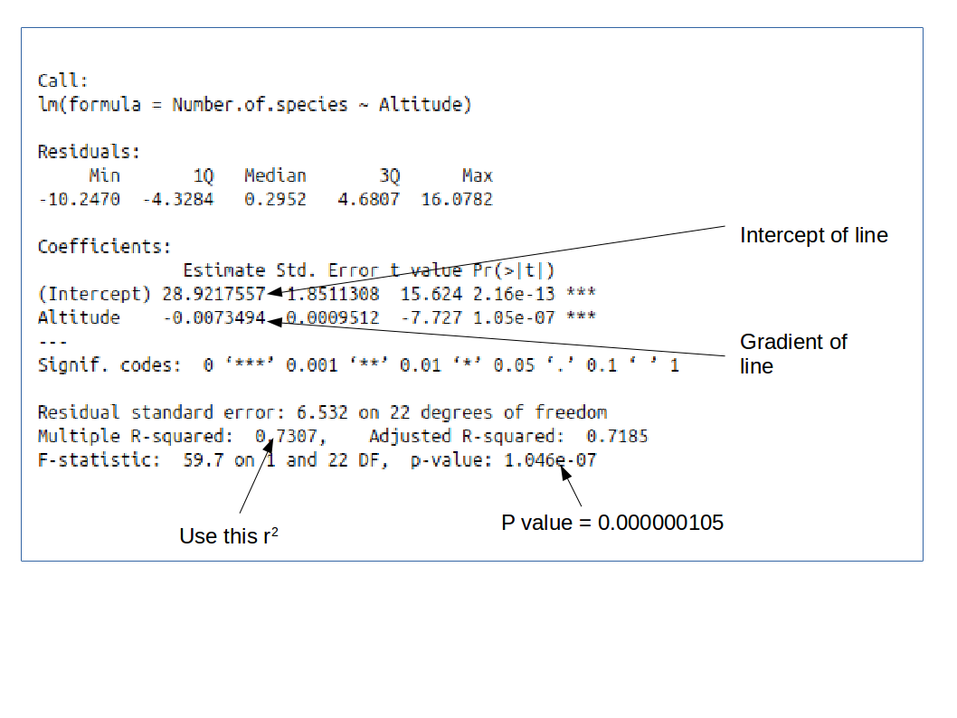
Download larger image here.
Other than understanding the p value is in standard form, interpretation is the same as for SPSS above.
DO NOT copy and paste output of SPSS or R into your work - unless you are specifically asked to put it in an appendix. Regressions such as these are simple tests, and can usually be summarised in a single line of text in your results section.
You will need to report the F value, the degrees of freedom (there are two values to report for this, in the same way as for ANOVA, the p value, and also the r2 value).
Example:
There was a significant negative relationship between altitude and the number of species found at that altitude (Regression F = 59.7, d.f. = 1 and 22, p < 0.001, r2 = 0.731)
Note, the p value isn't given to a huge number of decimal places. In general, give the exact p value, unless it is less than 0.001, in which case, just report it as done in the line above.
You may also want to refer to a scatterplot of the output - formatted as per the guidelines last year.
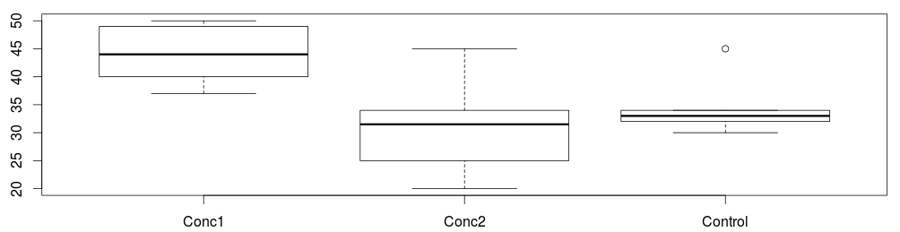
Don't forget to draw graphs of your data too. Either when exploring the data, or after the analysis. In some cases, the best fit may not be a straight line. Often a Spearman rank correlation can be better if this is the case.
Other tests